
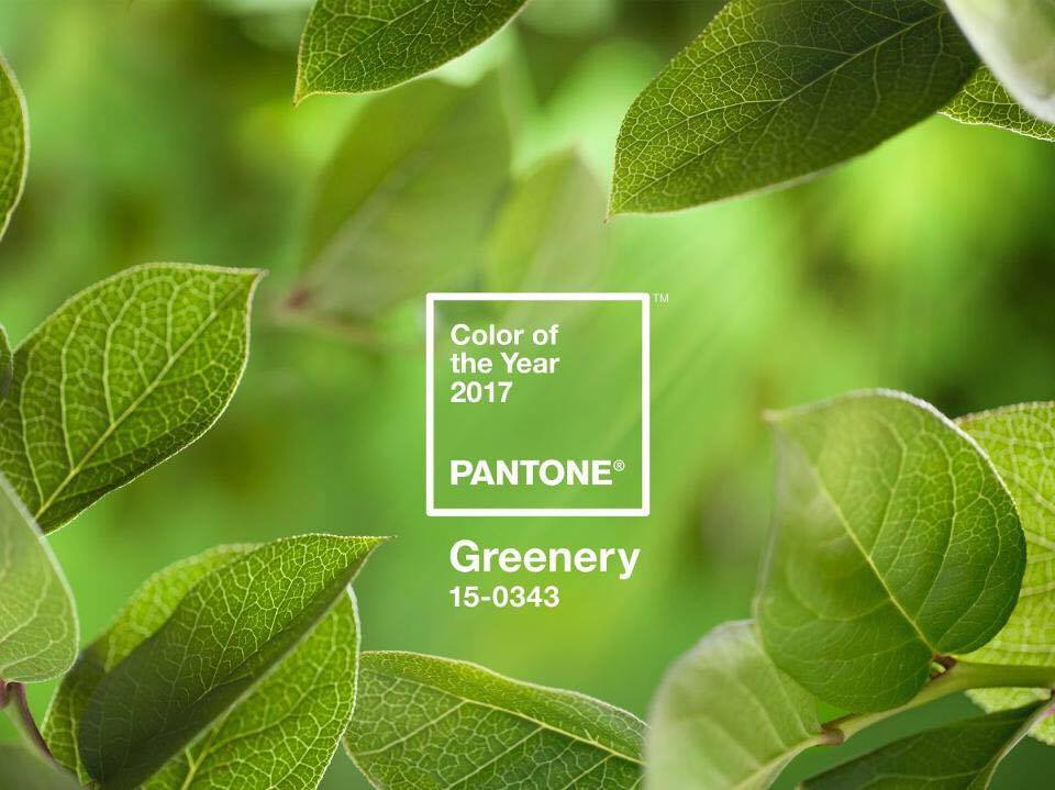
20 Mar The colors off 2017 – Greenery
Every year Pantone, officially announces the “Color of the Year” by a secret meeting takes place twice a year in a European capital. The company hosts and several representatives from various nations, discuss for two days and present analyzes to highlight the correct color. The result of this meeting, published annually in the «Pantone View» which and rush to buy especially people moving in fashion, decorators, designers and consumer companies to prepare and plan their future products.
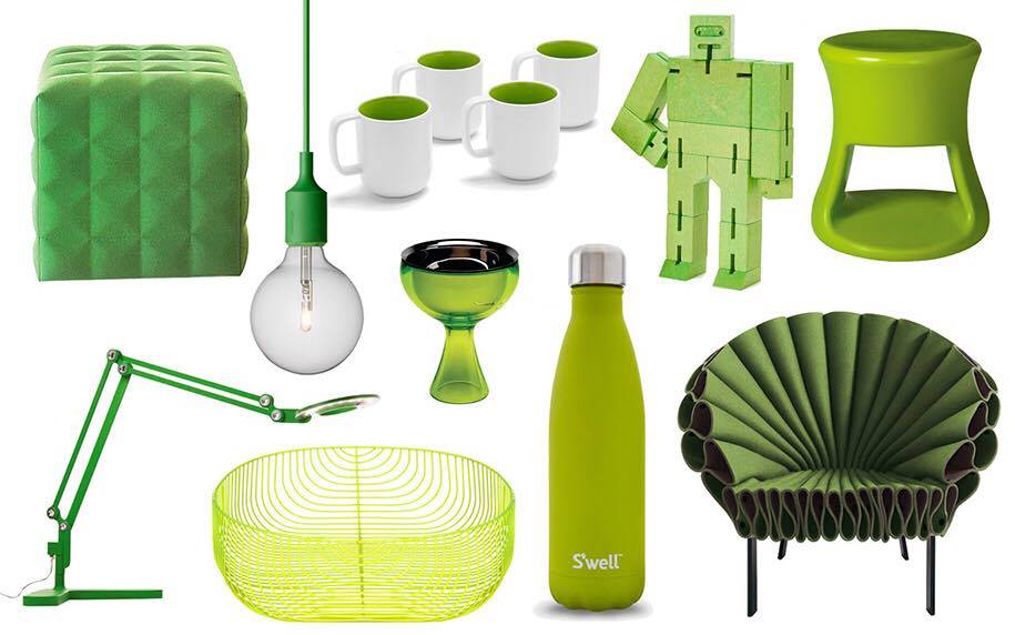
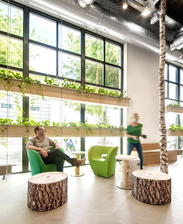
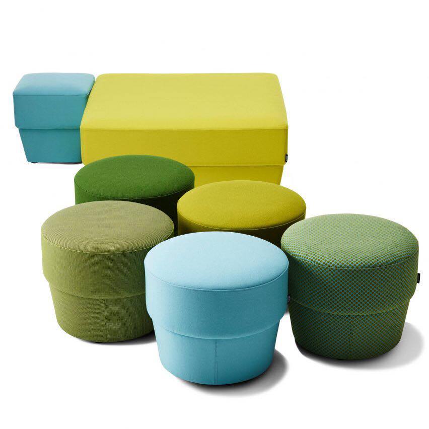
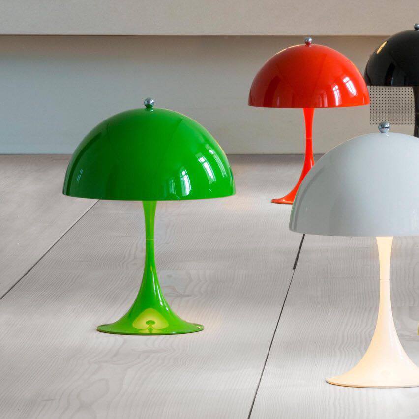
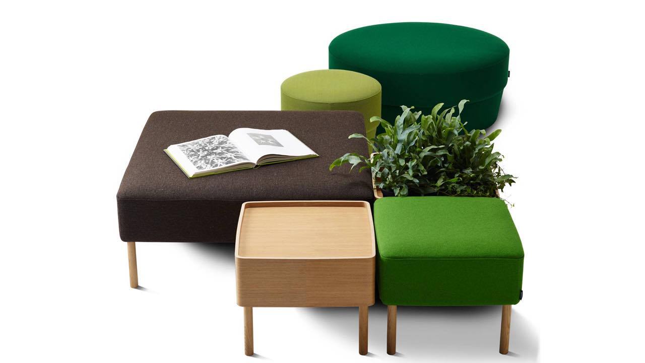
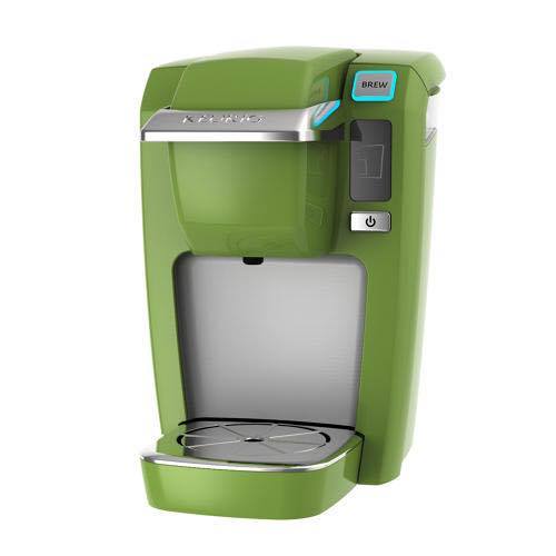
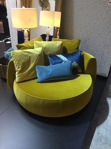
According to Pantone, therefore, the 2017 is the color code 15-0343 Greenery, a color that would characterize the bright green – yellow and which emits feelings of discovery, research, renewal (makes sense, after all, why we refers to the forest color, foliage, nature) designers and architectural material industries (furniture and items for the bath to cups and devices) is already ready for the color of the year already launching web objects adapted to the new trend and combinations of this !! The Pantone has cared for it because the color chart gives the achievable combinations of color in order to combine properly and avoid “bad !!” The possible combinations have to do with the “emotion – mood” that we want to create space ! Nothing in the aesthetics are not randomly selected if you want to be right result!
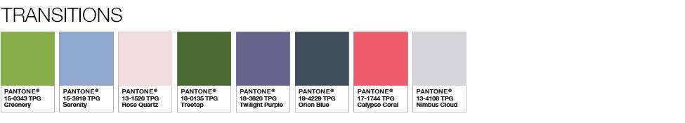
Transitions: Transitions colors, ie different colors together but whose transition from one to the other does not contain risks but is ideal.
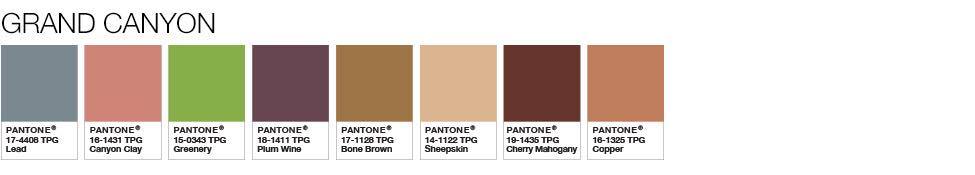
Grand Canyon: earth tones compatible with more emphasis on coffee
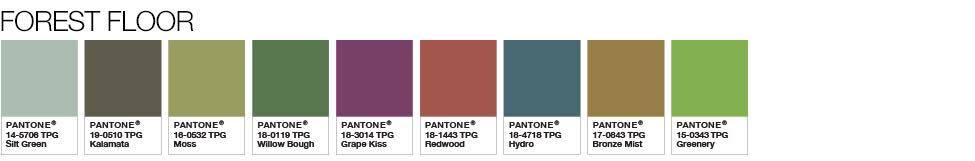
Forest floor: earth tones compatible for calmer conditions with more emphasis on green.
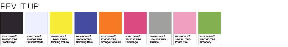
Rev it up: very intense combinations awakening and boldness. Fathomless: «deep» in intensity colors, modern and preservatives along with great style.
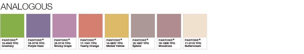
Analogous: says their name! Full quantity ratio, passing from one color to another smoothly.
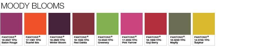
Moody blooms: «moody” completely crazy colors, where we move and the energy to lead
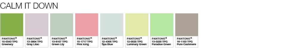
Calm it down: the softest of the series, reduce intensity of greenery to relax space!
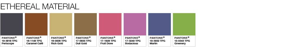
Ethereal material: sensual colors depth “strong – sensual situations!”
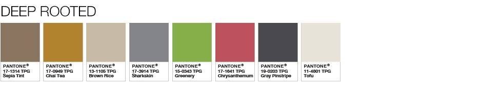
Deep Rooted: conservative colors, up classics will characterize with timeless style.
This is the magic of color! Whatever the hue, intense or soft, adapts to what you want to create! The important thing is that change, however small the big, creates euphoria and a better mood! Even the colored glass of water can turn water into more palatable! Imagine the renewal of your space!